|
|
|
Table properties
|

|
The Table properties dialog box is used for modifying a
table appearance. It consists of several tab pages:
The bottom part of each tab page has a window that displays the
current appearance of your table.
The Template tab page
Use the Template tab page to do the following:
- Select one of the given table appearance templates
- Save the current table appearance as a template
- Set one of templates as a default one
All table settings and templates are stored in the
HtmlTables.def file located in the GoldenSection Notes program folder.
Example of the Table properties dialog box, the
Template tab page:
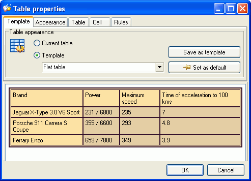
The Table appearance field group:
| Current table
|
The table appearance will be based on the current table. |
| Template
|
The table appearance will be based on one of templates that you
select from the dropdown list. |
| Save as template
|
Enables you to save the current table appearance as a template.
The Query... dialog box appears requesting you to enter the
name of a new template. |
| Set as default
|
Marks the current template as a default one. Newly made tables
will be based on this template. |
The Appearance tab page
Use the Appearance tab page to select a background for the
table and specify its width.
Example of the Table properties dialog box, the
Appearance tab page:
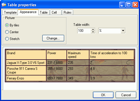
You can use the Picture section to load an image that will
be used as a table background. To load an image, click the
Load... button. The loaded image will be displayed in the
bottom pane of the Table properties dialog box under the
image of the table itself.
Now you can change the filling pattern:
- By tiles - the image is repeated for the entire background of
the table
- Center - the image is displayed once in the center of the
table
- Stretch - the image is stretched to cover the entire area of
the table.
To remove a table background, click the Load... button once
again and use the view image
dialog box that appears on the screen to delete the image.
The Table width field allows you to set table width in
percentage or pixels. Set 50% if you want the table to cover the
half of the editing dialog box's width. Depending on the size of
the dialog box, table width may change and stretch exactly to the
half of the current dialog box width. If you set table width as 200
pixels wide, the table will be exactly 200 pixels wide regardless
of the width of the dialog box.
The Table tab page
Use the Table tab page to select a table cell and header
colors, customize table border properties and its color.
Example of the Table properties dialog box, the Table
tab page:
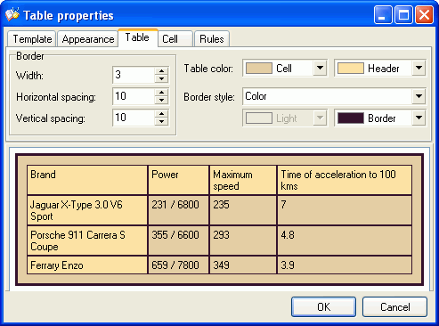
The Border field group:
| Width
|
Changes the table border width |
| Horizontal spacing
|
Changes the horizontal spacing between a border and a cell
(both left and right table borders) |
| Vertical spacing
|
Changes the vertical spacing between a border and a cell (both
top and bottom table borders) |
Dropdown menu for color selection:
Cell - allows users to change color of all table cells.
Header - allows users to change color of the table
header.
Use the Border dropdown list to set up an appearance and
coloring of table borders. This list contains possible border
appearance options:
- Raised
- Lowered
- Color
- Raised Color
- Lowered Color
Depending on your selection of the border type, the following
border color selection fields become available:
Border for the Color type; Light and
Shadow for the Raised Color and Lowered
Color types.
The Cell tab page
The Cell tab page helps you customize the appearance of
table cells.
Example of the Table properties dialog box, the Cell
tab page:
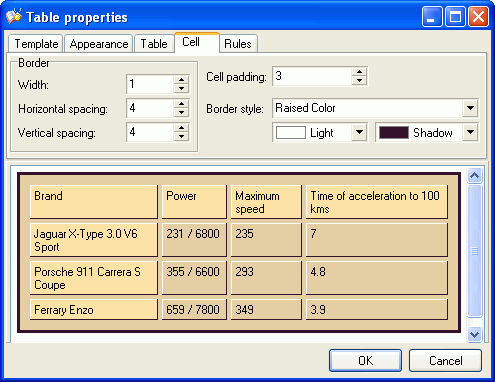
The Border field group:
| Width
|
Changes the cell border width |
| Horizontal spacing
|
Changes the horizontal spacing between table cells |
| Vertical spacing
|
Changes the vertical spacing between table cells |
The Cell padding field enables you to change the indent
between table cell borders and a text in the cell.
Use the Border dropdown list to customize appearance and
coloring of table cell borders. This list contains possible cell
border appearance options:
- Raised
- Lowered
- Color
- Raised Color
- Lowered Color
Depending on your selection of the border type, the following cell
border color selection fields become available:
Border for the Color type; Light and
Shadow for the Raised Color and Lowered
Color types.
The Rules tab page
The Rules tab page helps you customize the appearance of
table separators.
Example of the Table properties dialog box, the Rules
tab page:
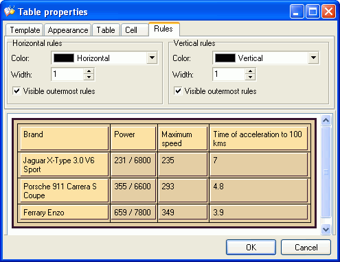
There are two field groups of separator settings: Horizontal
rules and Vertical rules.
| Color
|
Modifies the color of a separator. |
| Width
|
Modifies the width of a separator. With a width of 0, a
separator becomes invisible. |
| Visible outermost rules
|
Enables you to display an outermost separator between a table
border and cells. |
|

Copyright (c)
1999-2011 TGS Labs
|


